Art Direction
Given my work on the first game, I was given something of a blank slate for directing the visuals of this one. The first DoE had comic-style cutscenes between levels, so I wanted to pay homage to that by blending high detail assets and characters, with saturated colours, cel shading and bold outlines.
I also had a couple of intentions in mind for the visuals beyond artistic expression:
Eye-catching
Basic research around our genre and price point revealed that most games used Unreal Engine’s formidable PBR and lighting pipelines to achieve a realistic aesthetic.
I wanted a ‘The Simpsons’ effect, where someone casually flicking through steam would notice this game in a sea of more realistic titles.
Transferable
We were not working with a large art budget, so any stylisations made would need to be easily applicable to the assets from the previous game. So I needed a realistic-to-comic-book workflow on any existing assets.
Outlines
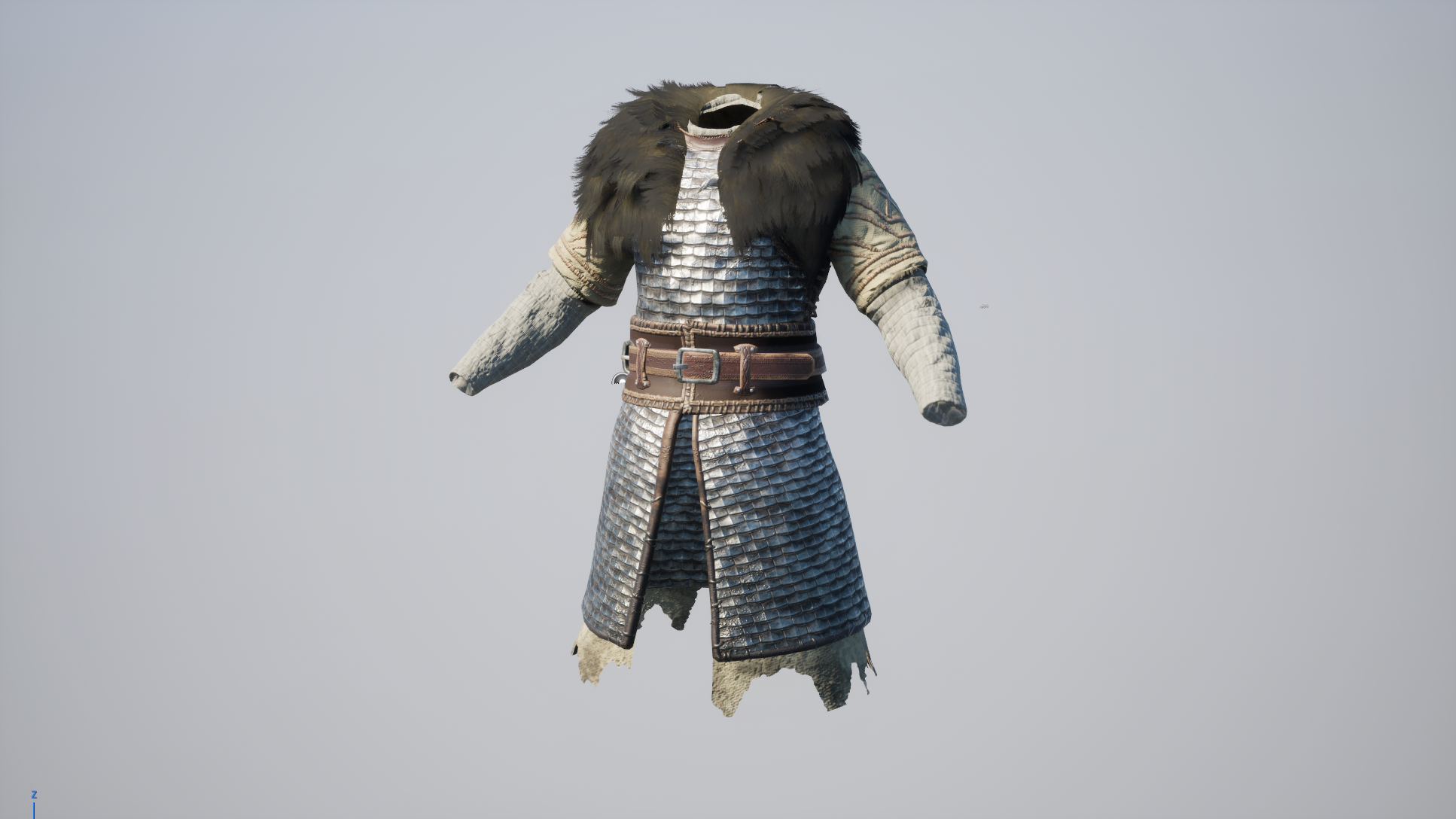
Initially, I depended entirely on a post processing outline effect that detected depth in 3D space, as well as edges on surface normals. This looked good in certain cases, but anything with a high amount of micro-detail was effectively buried in black (see below). I needed a better solution.
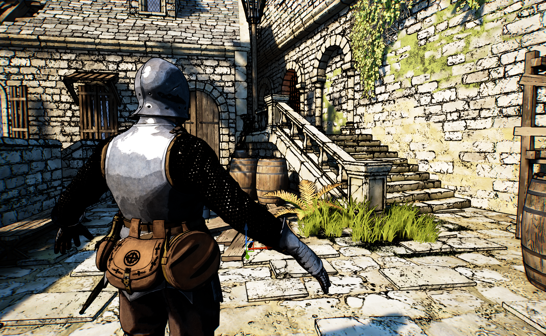
See how the brick outlines look okay, but the chainmail on the hero character is illegible.
One option was to dull the colour of the lines by blending them into the pixel behind. This made the image more readable, but the striking nature of the bold, black outlines was lost.
In a detailed scene (especially in motion), you’d be forgiven for thinking that there were no outlines at all.
So I tried pulling the outlines completely from the environment, so I could focus on making them look good on the characters, but this made them look totally out of place. I needed better control of the line weight on any given asset, which led me to one solution…
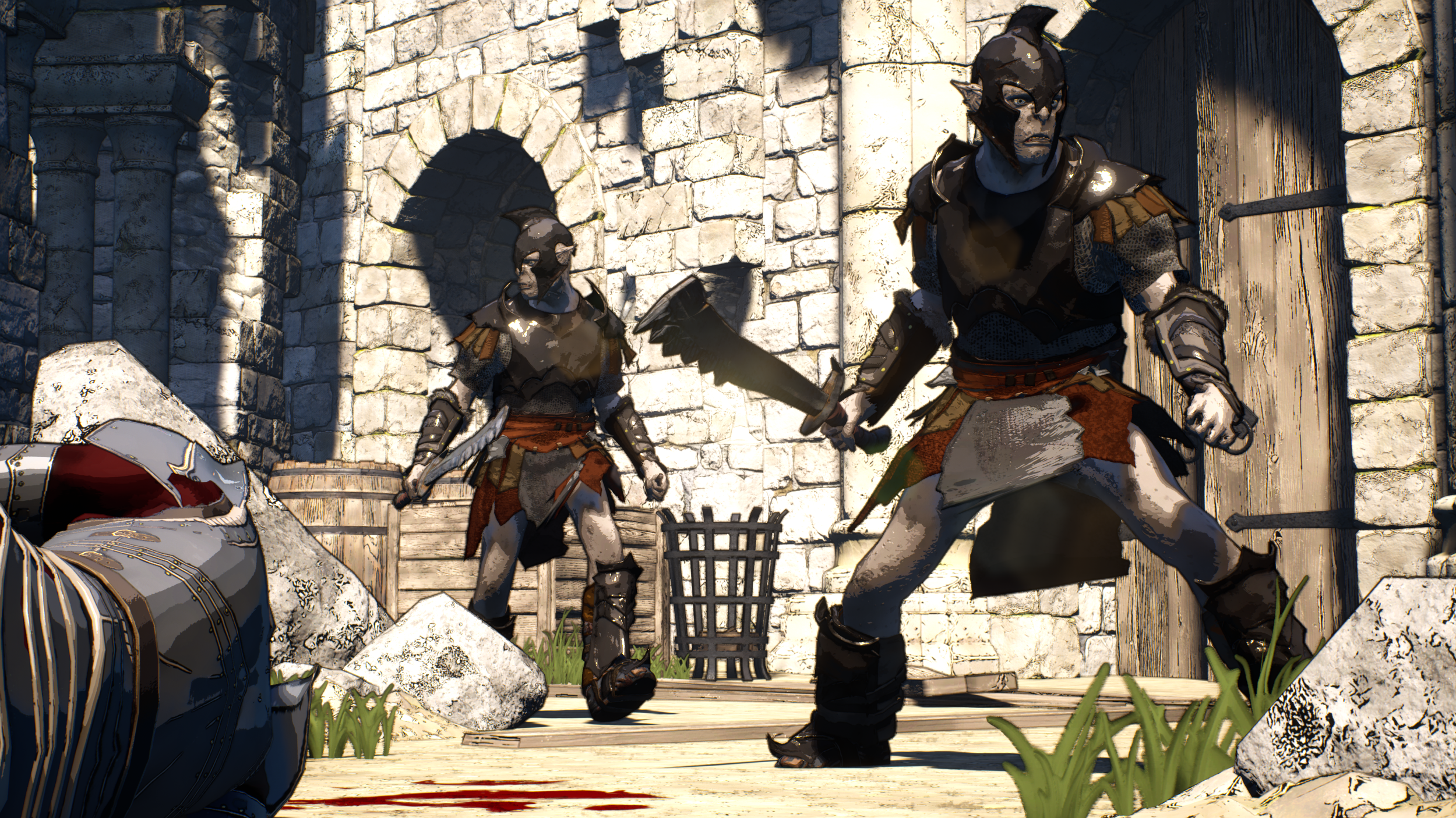
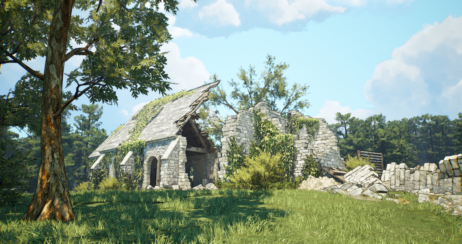
The visuals came down with a terrible case of “Epic Games Marketplace-itis”. Consider the discrepancy between the orcs and the brickwork in the background.
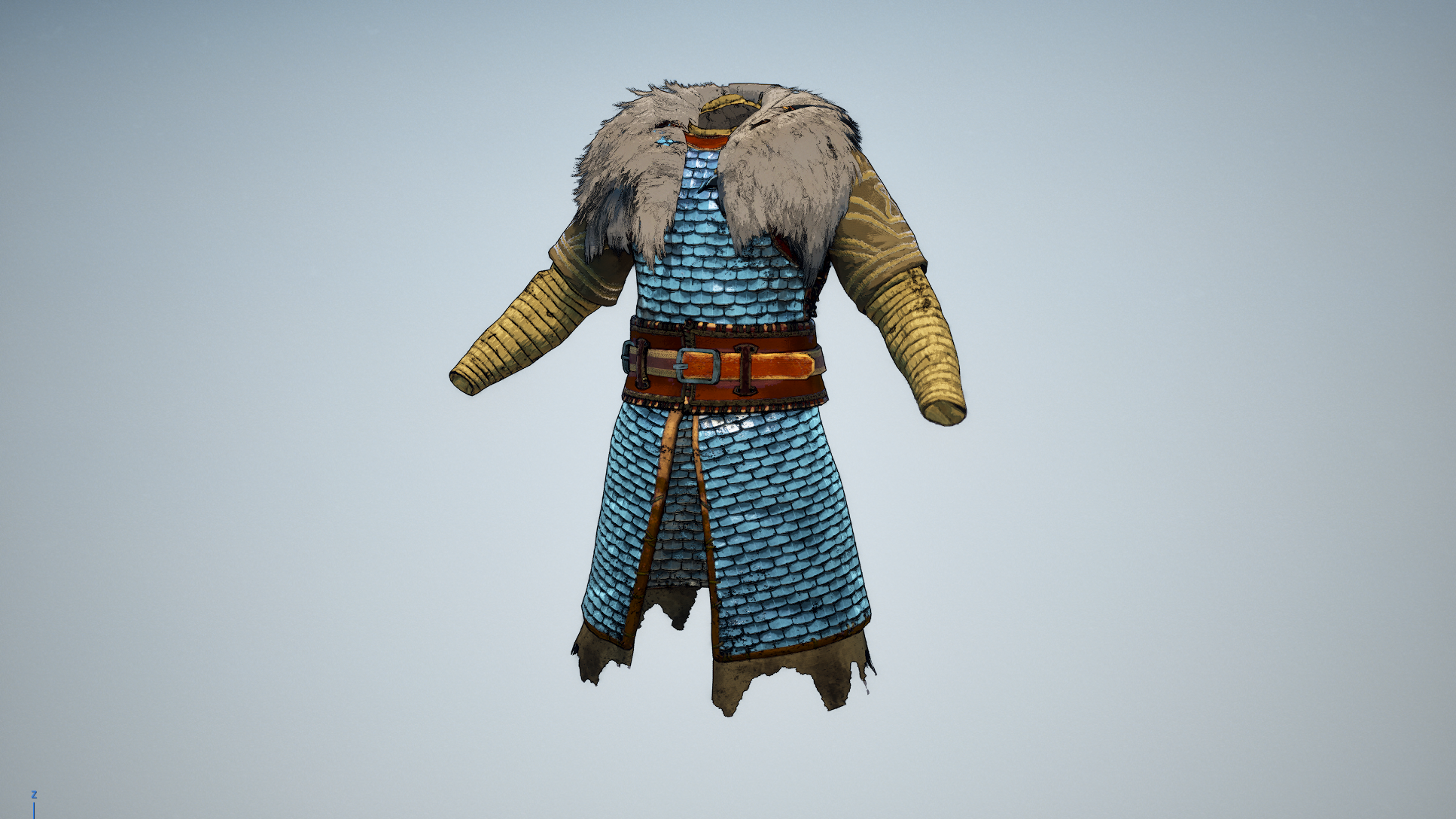
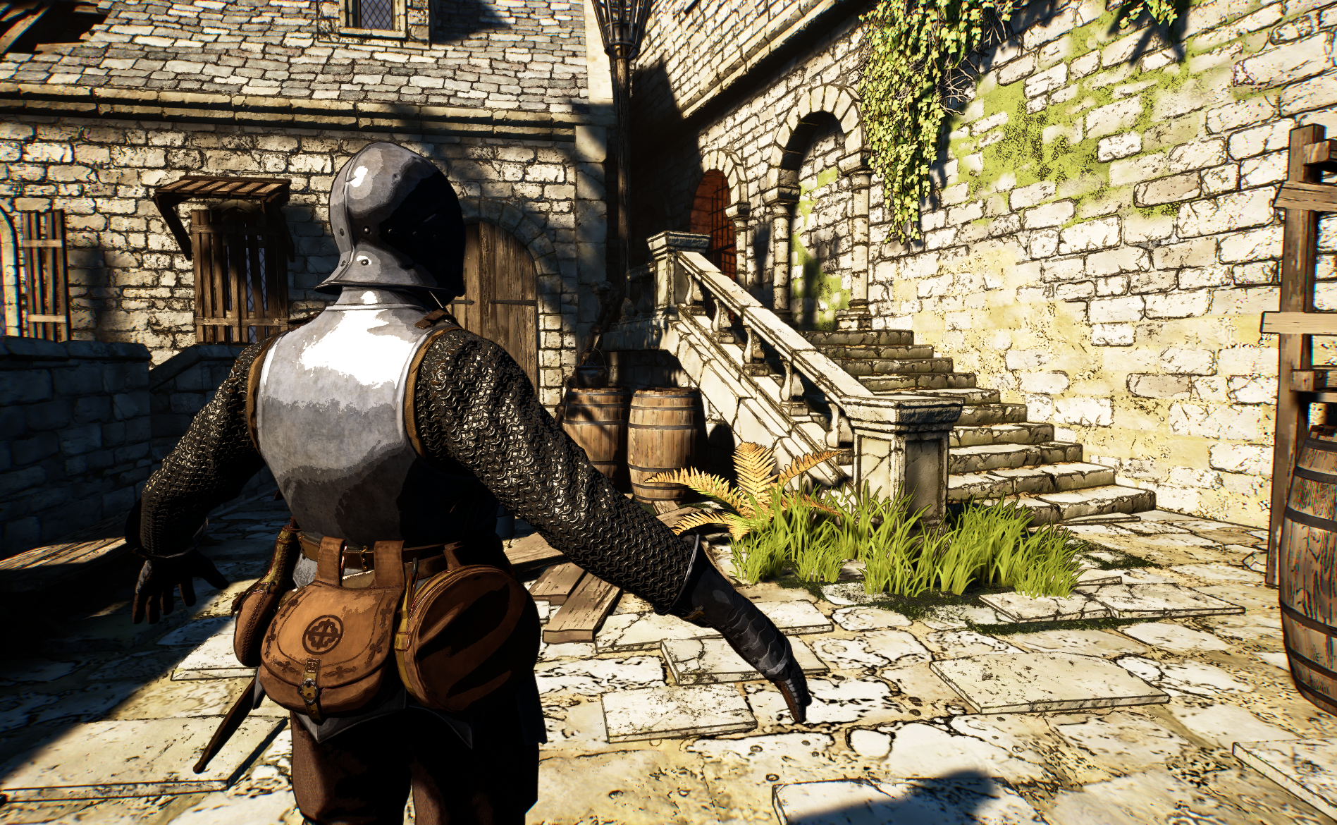
I devised a workflow in GIMP that edge detected for outlines on the diffuse texture. Now I can consider texel density at source and have uniform line weights across the game.
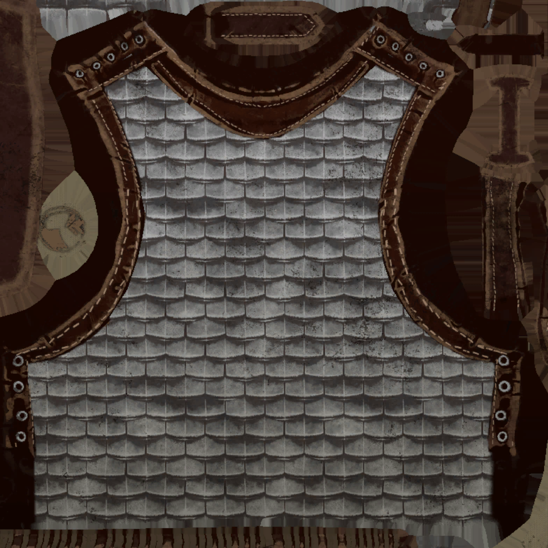
See how the form of the mail and the leather bands have been emphasised with outlines.
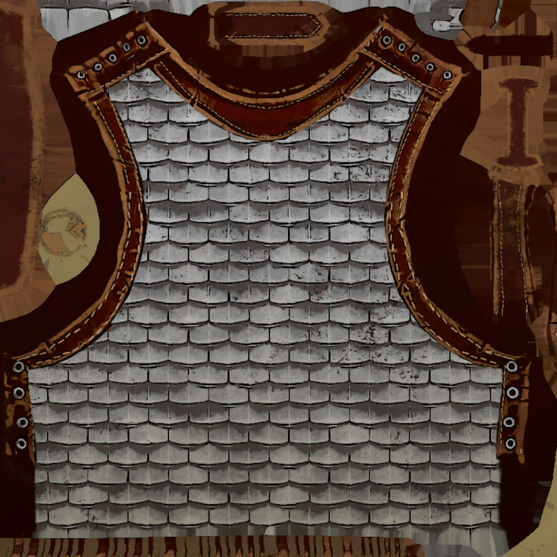
The in-texture solution looked great, but was slow to iterate, so I created this material function so my artists and I could quickly adjust the intensity of the outline effect.
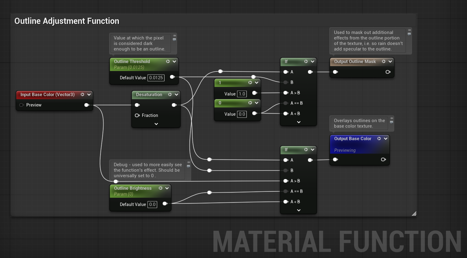
The function, attached to a given master material, allowed for outline adjustments on a per-material basis.
With some attention paid to lighting and colour choice, I arrived at something shippable. It met the technical demands of the game, as well as looking unique.
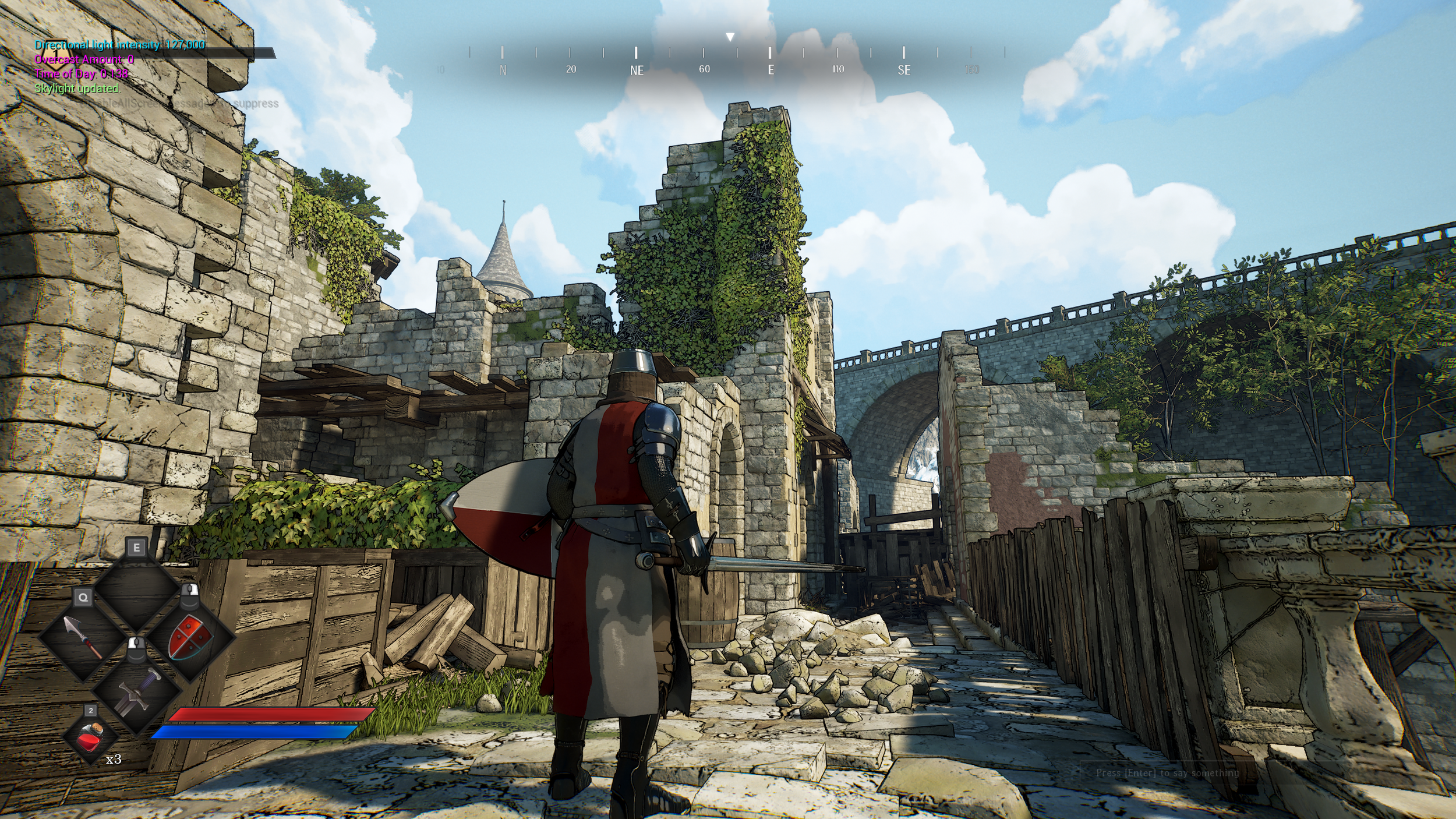
The characters looks more cohesive with the rest of the environment now, and the whole image is striking and eye-catching.